🎨 The AI Slop Problem
"In 2026, if your app doesn't have good design, it might be dead in the water before you launch. But if you've tried designing with AI coding tools, you've probably got a lot of AI slop." The narrative around AI coding agents is all about speed — how fast you can build and ship. "But that jumps the gun. Moving too fast." 0:00
Chris's background: 15 years designing apps and advising startups on product and design, having helped hundreds of people build, launch, and get real customers. 0:53
📐 Define → Design → Build
The mindset shift: instead of jumping straight from idea to build, insert Define and Design first. 2:14
Why design before build, two reasons: (1) design isn't just visuals — it's the UX, the onboarding flow, the landing page, and three "magic" points: the aha moment, the landing page / App Store listing, and the onboarding flow. (2) A professional-level design system documented up front gives AI a strong reference foundation before it writes any code. "So much easier to start from professional design than to build and fix the design later." 3:36
🔑 The 3 Keys: References, Clarity, Taste
| Key | What it means |
|---|---|
| Great references | A strong starting point and inspiration — "even the best designers copy other people's work" |
| Idea clarity | Know exactly what you're building, the key screens, and the aha moment — so you can rough-design the key screens first |
| Learned taste | Taste isn't innate — you learn it by surrounding yourself with high-quality design (curate your social feeds) |
"Taste is not something you have or you don't. The easiest way to learn it is to surround yourself with high-quality design — curate your feeds so design content comes up daily, and it retrains your brain." 4:44
🎢 The Example: "Ride It"
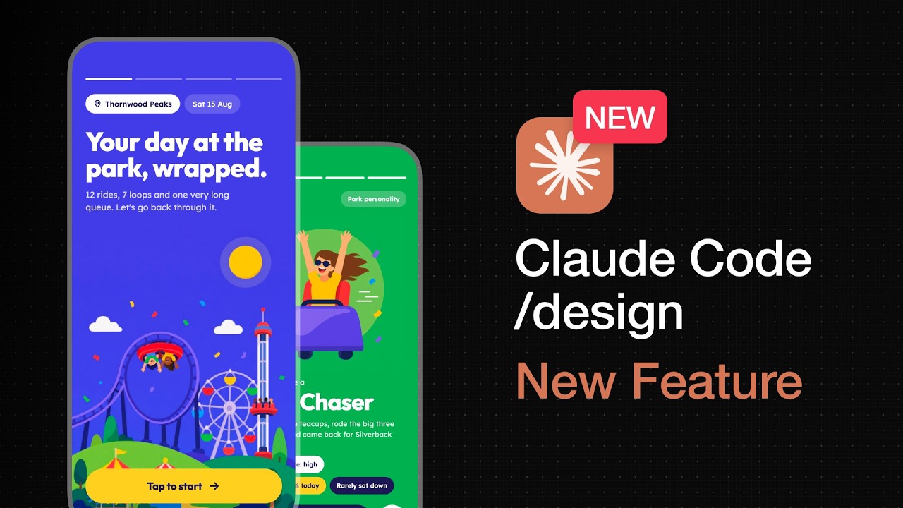
The project: Ride It — Share Your Adventure, a consumer app for theme park goers to share their day Spotify-Wrapped style (for Chris's own upcoming LA theme park trip). 6:16
The magic moment: the Spotify-Wrapped-style day recap — and crucially, the personality archetype screen, which Spotify's own data shows is the most-shared screen. Three criteria for the shareable recap: it must be shareable (the growth engine), it must include the personality archetype, and it must be colorful/playful/exciting. 9:15
💻 Live Demo with /design
The workflow in the Claude Code desktop app: create a session, select the folder, paste a reference image (a flat-vector illustration style he likes), set Fable 5 on "high" (no higher reasoning needed), then type /design and ask. 10:31
Claude Code reads the empty folder, builds from the reference image ("flat chunky vector illustration, bold rounded geometric type, saturated candy palette, big radius cards, playful asymmetry"), and proposes a rich outline — using the phone's sensors (accelerometer, gyro, GPS, barometer) for stats like "times upside down, top speed, biggest drop, total airtime," plus a park-personality archetype. It asks three quick questions before drawing (static vs clickable, real vs fictional names, archetype as its own screen or merged). 13:28
🔀 Two Design Directions
From the canvas, he edits via the properties panel (font → Lexend, bold → regular, etc.), then explores a second direction: goes back to Dribbble, screenshots an isometric 3D line-art style, drops it in, and asks for "an alternate set of designs using a more isometric line-art style applied to cards and buttons, so I can compare the two directions." 18:18
His verdict: "I prefer the first color direction but with the illustration style of the second." The AI vector illustrations "always tend to look kind of funky" — which motivates the next step. 22:10
🖼️ Higsfield for Illustrations
To replace the sloppy AI vectors, he connects Higsfield (image/video generation) to Claude Code via MCP: go to Higsfield's /mcp, copy the Claude Code command, paste it in the same session. Then Claude Code generates the cover illustration and all the other screen illustrations, using ChatGPT image 2 as the model. 21:18
One legal note: "We can't actually use the word 'Wrapped' — that's trademarked by Spotify. They'll have a go at you." 25:15
📚 Turning It Into a Design System
The final step: use a "design system" skill (from his Product OS) to turn the chosen screens into a documented design system. Claude Code extracts the visual styles and produces two files: 26:40
| File | Purpose |
|---|---|
design.md | All tokens and styles — colors, typography, spacing, radius, elevation — for the agent to read and follow |
design.html | A visual guide: components listed, do's and don'ts, everything visualized |
✅ Key Takeaways
- Define before you design, design before you build. Speed is the wrong instinct — the aha moment, landing page, and onboarding flow must be designed first.
- Three keys to great AI design: great references, idea clarity, and learned taste (curate your feeds).
- Start from proof, not originality. Find what people already pay for, then differentiate — ideally by modernizing an outdated idea.
- Claude /design brings design into Claude Code. Same session, same folder — design and code happen in one place, ideally driven by a design system or reference image.
- AI vector illustrations are the tell. Replace them with real generated images (Higsfield via MCP) and ask Claude Code to write the image prompts.
- Extract a design system (design.md + design.html) so your agent applies the style consistently — and wire it into agent.md/code.md.
🔗 Resources & Links
- 📺 Original video — Build Great Products
- 🛠️ Product OS — Chris's full system