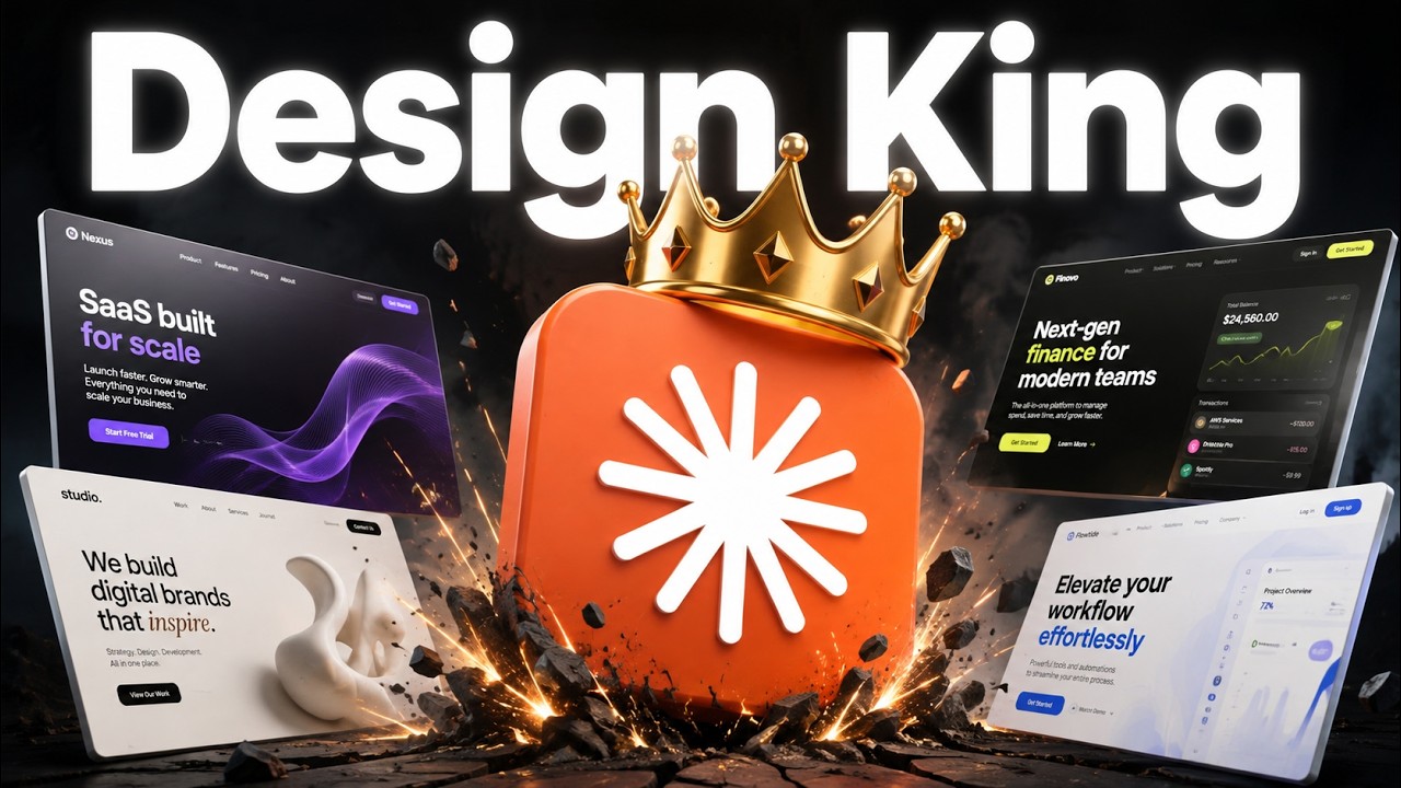
🎯 The Premise
Nate's favorite sites built with Claude all share one thing: layering + scroll responsiveness — mountains/tree-lines on separate planes, text that animates in, cards that stack. "It adds a premium feel." The same premium feel carries to mobile. 0:00
The core realization: "you can't just say 'make this look professional, make this feel premium.' You have to give it something to work off of — otherwise you get AI slop."
🔍 Finding Inspiration
Four ways to feed real design references to the model. 4:15
| Source | What to grab |
|---|---|
| A site you love (e.g. Fora) | Deconstruct specific elements — "I love the layering, replicate it" (back/middle mountains, laptop, front trees) |
| 21st.dev | Individual components with copy-paste prompts for animations (container scroll, gradients, interactive elements) |
| godly.websites / godly.design | Trending sites, logos, hero sections, CTAs, footers, OG images |
| Awards (award sites) | Award-winning sites by category (tech, e-commerce, restaurant, fashion) — "your site converts better if it feels like your niche" |
| Motion Sites | Jaw-dropping animated backgrounds you can drop into your hero |
Cloning a competitor's feel: for Glydo, he pointed Fable 5.1 at a competitor (Lemon) and said "take our brand guidelines and insert them onto a page like this" — "it can inspect what's going on and generate one that feels the exact same."
📝 The One-Shot Prompt
Using his ScrollCraft skill, one prompt produced two distinct, impressive sites (Ferna + Low-key keyboard). 7:00
The prompt pattern: give it a good example site + the goal + "build two distinctly different but most impressive layered sites using my ScrollCraft skill" + point it at inspiration sources (AIS site, 21st.dev components, godly.websites) + "generate any assets you need, keep it subtle but premium, go."
Results: Ferna (fresh herbs) — layering, text pops/fades, stacking cards, a scroll video that grows over time, a final "light turns on" video. Low-key (keyboard) — keys that press, keyboard disassembles to show inside, color picker, desk scrolling behind. "One-shot prompts give you a really good base to work from."
🧭 7 Design Principles (baked into ScrollCraft)
1
Brand guidelines. Logo, colors, consistency — so the site feels cohesive.
2
The three P's. Pain (problem solved), Person (who you solve it for), Promise (how it solves it for them).
3
Scroll responsiveness. The user should feel in control — text appearing, subtle feedback as they scroll. "Even just words appearing makes it feel premium." (Some feedback said "I hate flying through a 3D world" — it depends on the business/three P's.)
4
Inspiration. "Very hard to tell it what you want and not get AI slop. You need at least a little inspiration" — layering, pricing-section feel, interactive background.
5
Grab existing components. Borders, buttons, FAQs, text — from 21st.dev — to feel more dynamic and branded.
6
Verify on mobile. "So many people look you up on mobile. Make sure it works and looks good there."
7
Verification (screenshots). For scroll animations, have it screenshot frame-by-frame as it scrolls — "essentially watching a video of how you'll experience it" — so it catches "this looks bad, this is out of bounds, this color's off."
⚖️ Fable 5 vs 5.1
He built a bunch of sites with both, same prompts/assets/brand guidelines/skill. 13:48
Quality: essentially a wash. "None of them clearly blew the other out of the water — they felt very similar. Those seven principles matter more than which model you use."
Cost: Fable 5.1 was consistently cheaper. Sample runs: 1824 vs 2022, 1452 vs 1467, 1283 vs 2164, 1118 vs 1737. This matches Anthropic's release note: "Fable 5.1 up to 25% cheaper on knowledge work, up to 45% cheaper on heavy agentic coding." After hours of builds, Nate used only ~45% of his weekly Fable limit — "I've blown through it in 1–2 hours with Fable 5 before."
💡 Key Takeaways
- Layering + scroll responsiveness = premium feel — separate planes, animated text, stacking cards.
- Never prompt "make it premium" in a vacuum — always give real design references (Fora, 21st.dev, godly, Awards, Motion Sites).
- Deconstruct what you love — "I love the layering, replicate it" beats "make it look good."
- Cloning a competitor's feel works — point Fable 5.1 at a rival and map your brand onto it.
- 7 principles > model choice — brand guidelines, three P's, scroll feedback, inspiration, components, mobile, screenshot verification.
- Verification is screenshots — frame-by-frame so the model sees what you'll experience.
- Fable 5.1 ≈ Fable 5 on quality, but cheaper — up to 45% cheaper on agentic work.